Linking Interactive Notebooks
Evolve markdown documents and notebooks into structured data
MyST allows you to directly include Jupyter Notebooks in your books, documents and websites. This Jupyter Notebook can be rendered directly using MyST.
For example, let us import altair and create a demo of an interactive plot!
Please note that all of the data included in my project was either publicly collected or fictional for the purposes of demonstration only.
Geodatabase
Base Map
I used an imagery basemap from Esri with WGS84 web mercator for the coordinate and projection systems. Image resolution is 0.3 meters.
Beyond the base map, working with feature layers is similar to Object Oriented Programming (OOP). Each feature is a class with its own attributes and methods. The attributes are what goes into the dataset for each feature. I’m not going into any methods in my case study because I’m focusing on building the geodatabase.
So, I defined the basic attributes for each of the following seven feature classes. I also used subtypes and domains examples to classify the data and restrict data entry errors. I included the metadata for a few attributes for each class in the side panel below. I also included domains and subtypes when available. Please scroll down to see them.
Please note that all of the data and attributes were fictional. None of the information is accurate or operational. It is intended only for demonstration purposes.
Source
import geopandas as gpd
import leafmap

m = leafmap.Map(center=[32.7658, -117.2264], zoom=17)
m.add_basemap("Esri.WorldImagery")
mimport altair as alt
from vega_datasets import data
source = data.cars()
brush = alt.selection_interval(encodings=["x"])
points = (
alt.Chart(source)
.mark_point()
.encode(
x="Horsepower:Q",
y="Miles_per_Gallon:Q",
size="Acceleration",
color=alt.condition(brush, "Origin:N", alt.value("lightgray")),
)
.add_selection(brush)
)
bars = (
alt.Chart(source)
.mark_bar()
.encode(y="Origin:N", color="Origin:N", x="count(Origin):Q")
.transform_filter(brush)
)We can now plot the altair example, which is fully interactive, try dragging in the plot to select cars by their horsepower.
points & bars# https://matplotlib.org/stable/gallery/statistics/time_series_histogram.html#sphx-glr-gallery-statistics-time-series-histogram-py
from copy import copy
import numpy as np
import numpy.matlib
import matplotlib.pyplot as plt
from matplotlib.colors import LogNormHere we reference plot output
# Make some data; a 1D random walk + small fraction of sine waves
num_series = 1000
num_points = 100
SNR = 0.10  # Signal to Noise Ratio
x = np.linspace(0, 4 * np.pi, num_points)
# Generate unbiased Gaussian random walks
Y = np.cumsum(np.random.randn(num_series, num_points), axis=-1)
# Generate sinusoidal signals
num_signal = int(round(SNR * num_series))
phi = (np.pi / 8) * np.random.randn(num_signal, 1)  # small random offset
Y[-num_signal:] = np.sqrt(np.arange(num_points))[
    None, :
] * (  # random walk RMS scaling factor
    np.sin(x[None, :] - phi) + 0.05 * np.random.randn(num_signal, num_points)
)  # small random noise


# Now we will convert the multiple time series into a histogram. Not only will
# the hidden signal be more visible, but it is also a much quicker procedure.
# Linearly interpolate between the points in each time series
num_fine = 800
x_fine = np.linspace(x.min(), x.max(), num_fine)
y_fine = np.empty((num_series, num_fine), dtype=float)
for i in range(num_series):
    y_fine[i, :] = np.interp(x_fine, x, Y[i, :])
y_fine = y_fine.flatten()
x_fine = np.matlib.repmat(x_fine, num_series, 1).flatten()
Important! This data is simulated, and may just be random noise! 🔊
fig, axes = plt.subplots(figsize=(8, 4), constrained_layout=True)
cmap = copy(plt.cm.plasma)
cmap.set_bad(cmap(0))
h, xedges, yedges = np.histogram2d(x_fine, y_fine, bins=[400, 100])
pcm = axes.pcolormesh(
    xedges, yedges, h.T, cmap=cmap, norm=LogNorm(vmax=1.5e2), rasterized=True
)
fig.colorbar(pcm, ax=axes, label="# points", pad=0)
axes.set_title("2d histogram and log color scale");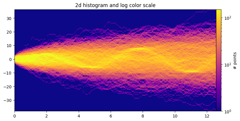
import leafmap.foliumap as leafmapm = leafmap.Map(height=600, center=[39.4948, -108.5492], zoom=12)
url = "https://github.com/opengeos/data/releases/download/raster/Libya-2023-07-01.tif"
url2 = "https://github.com/opengeos/data/releases/download/raster/Libya-2023-09-13.tif"
m.split_map(url, url2)
murl = "https://github.com/mohamadyassin/myst_airc/releases/download/data/FoodandBeverage.geojson"
m = leafmap.Map(center=[32.7658, -117.2264], zoom=17)
point_style = {
"radius": 5,
"color": "red",
"fillOpacity": 0.8,
"fillColor": "blue",
"weight": 3,
}
hover_style = {"fillColor": "yellow", "fillOpacity": 1.0}
m.add_geojson(
url, point_style=point_style, hover_style=hover_style, layer_name="FnB"
)
m